Time for website shenanigans, tweening sorcery and Scandinavian interior design.
Mattias
Business Development
I love making games, but I also happen to really enjoy business development and leadership. Currently I’m able to work on both, which makes me really excited. So while the others are cracking code and whipping paint, I’m going ham on value propositions, scheduling, and marketing plans (and more). Will dig deeper into this in future posts!
Web Design
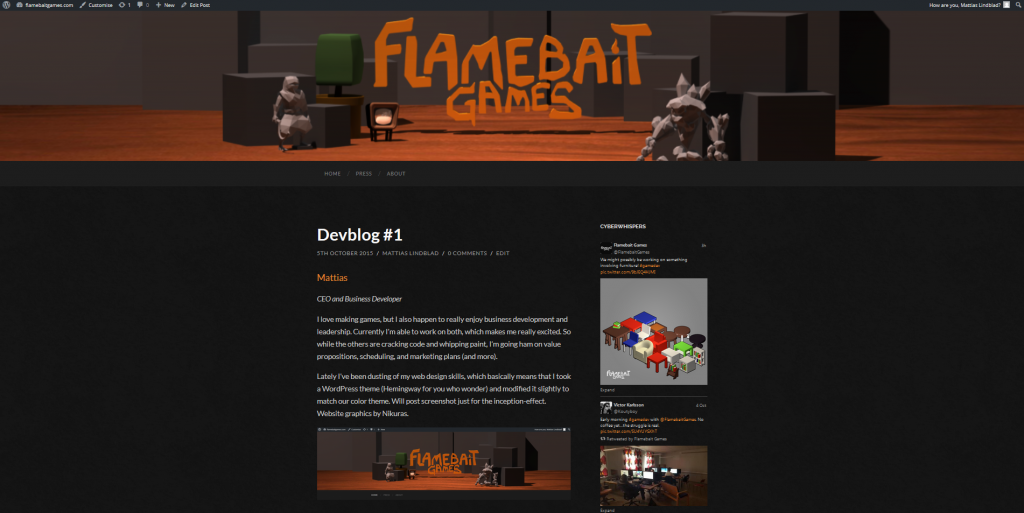
Lately I’ve been dusting of my web design skills, which basically means that I took a WordPress theme (Hemingway for you who wonder) and modified it slightly to match our color theme. Will post a screenshot just for the inception-effect. Website graphics by Nikuras.
Nikuras
Good afternoon! During the last month I have mainly been working on the User Interface for DecoStep, which has been both interesting and weird since I’ve never really done that type of artwork before. I have also been working a lot on our studio logo, together with Hong Zhang (who is helping us out with 2D art). Fairly happy with how it looks at this point, although if you think it looks like horseshit I strongly encourage you to tweet us (plug @flamebaitgames) or sent us an angry mail about it! 🙂
I also made a little hit-effect in flash recently, not relevant to Flamebait but moving images are always cool.
Viktor
This past week I’ve been focused on preparing a demo-pitch me and Mattias did, I think it went quite well and we got a lot of great feedback on how we can work on improving our product and getting to know what our players want/need. After the pitch we were invited to participate in a pitching contest in a few weeks (!), so in the coming days I’ll be trying to better put into words what we want to achieve with the game we’re working on. I haven’t worked on any sound design or music since we did a prototype of the game in August, but I can’t wait to get started on it soon enough!
Goose
Furniture
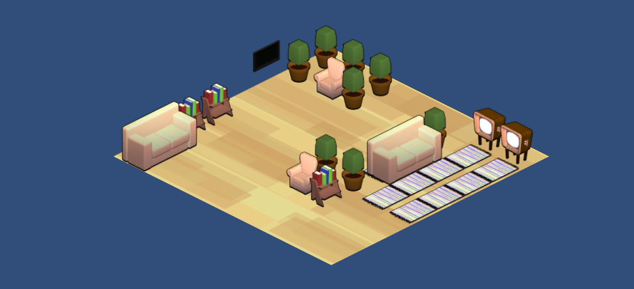
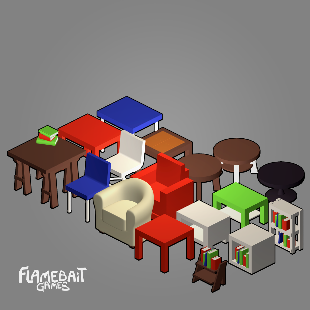
I’ve been working on furniture inspired by scandinavian interior design. The current focus is on single tile furniture as we do not yet have support for furniture that is intended for several tiles yet. Scandinavian design feels like a good starting point when creating furniture for a game centered around interior design as it tends to complement a variety of other interior design movements. It’s also relatively boxy which is a plus if you’re lazy like me. This week I’m going to continue working on furniture that follows scandinavian design principles as we want that to be one of the first complete “sets.” More stuff incoming!
Victor Karlsson
After a few rough weeks learning the new Unity 5 UI system, I have finally (somewhat) come to terms with it. Considering the UI has to be a lot more interactive than what Unity pre-made scripts could offer I had to implement a lot of the features myself.
Let’s begin!
UI
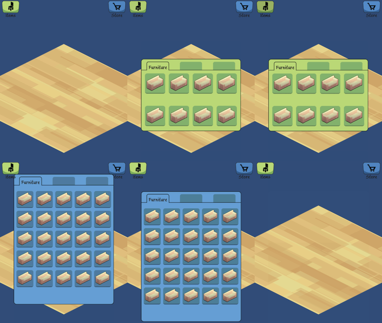
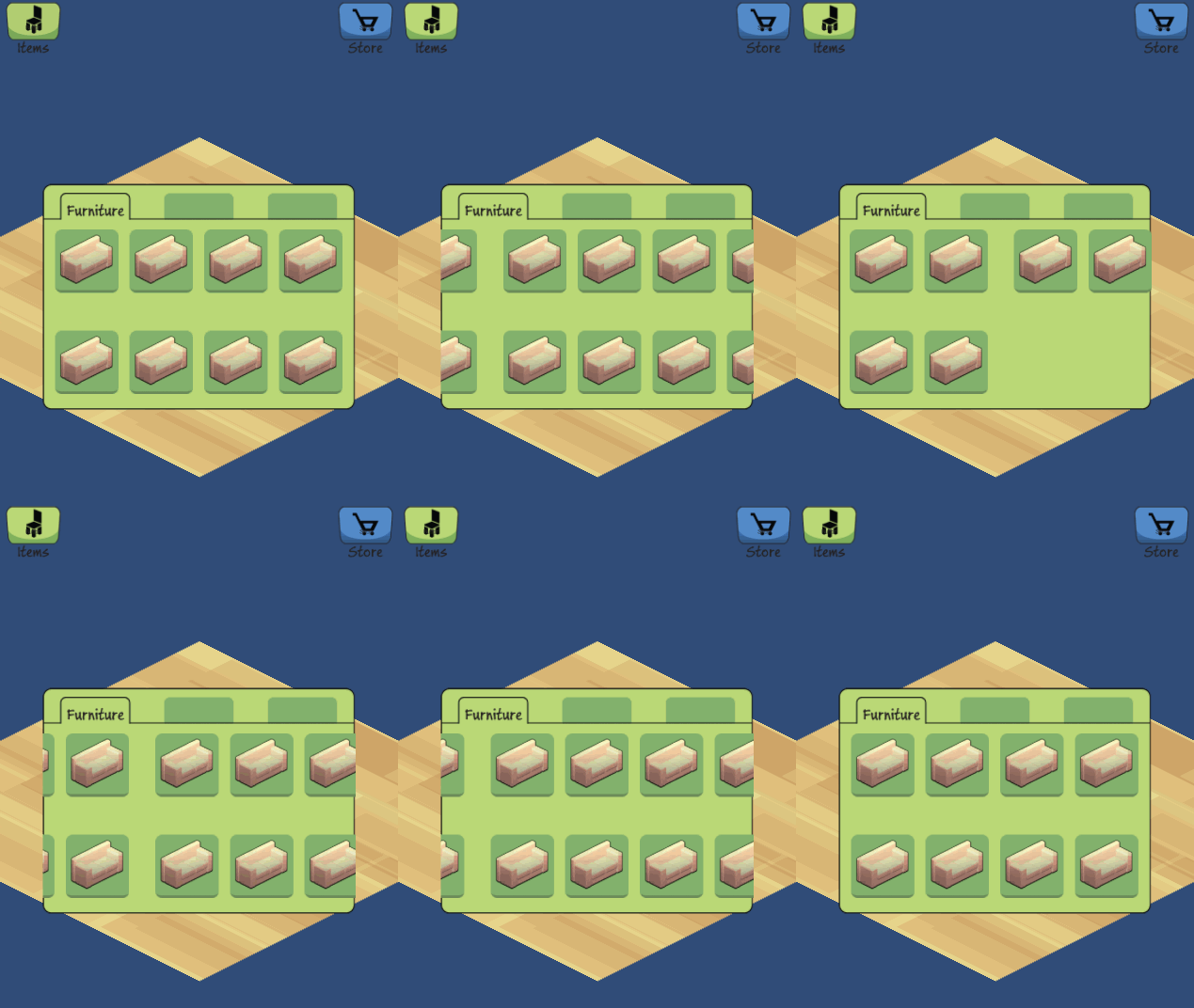
I implemented the rough base for the inventory and shop window, which displays items in a grid. Unfortunately Unity’s built-in grid script didn’t position the items like I wanted and offered me very little options to tweak the layout.
I instead decided to roll my own implementation, that allowed me to easily deal with scaling, positioning, sliding and padding for any arbitrary UI window.
Chunks
When first designing the shop-window I didn’t anticipate scrolling/sliding through the item list presented by the window. It was a bit of a mess to deal with, since they had to be grid-aligned most of the time but suddenly slide out of the view, thus not being aligned anymore.
To deal with this (and items) in general, I made a small class that represents a fragment of the items. This represents the offset of all the items within the chunks (making tweening easy) and what slice of the total item list it represented.
Another neat aspect of managing items this way, is the ability to easily load/unload chunks that aren’t near the current one being displayed. This lowers memory consumption and as a side-effect only produces drawcalls for items that are in-view (or soon to be in-view). Neat!
Tweening
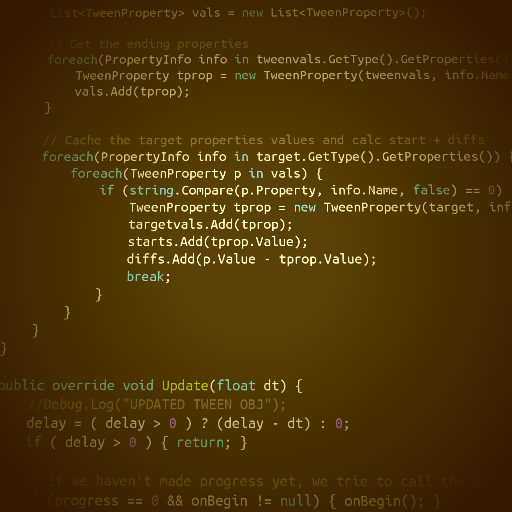
In one of our old projects I made a quick (and dirty) implementation of a tweening system, implementing most of the standard curves. It uses C# reflection to tween arbitrary attributes and supports groups, callbacks and other various goodies.
Porting this required very little effort, which allowed me to implement certain features like opening/closing the shop or inventory windows easily. It also became handy when sliding in/out new items in the window.
Next up!
Next on the agenda is prettifying the code so it’s somewhat readable for other developers and implement a proper pedometer that works on mobile devices.
Niklas Lindblad
Floor
Isometric games are timeless solution to a since-long solved problem; but the cheap rendering costs rhymes quite nicely to mobile devices. The floor is a single plane divided programmatically into a multitude of equally sized squares intended to be used to house furniture. Implementations like this has been done many times over, so I won’t go into further details here.
Furniture
Floors without stuff on them are incredibly dull; but looking past the obvious, furniture one of the cornerstones of this interactive experience. I did find, however, that the placement of these flat works of fictional craftsmanship was less than trivial. This was due to the nigh-absurd angle that the isometric projection proposes which lead to a quite interesting mathematical conundrum, but alas that would be too much detail for a post such as this!
AssetBundles
Unity can be a benevolent mistress, and AssetBundles is certainly an instance of this engine’s generosity. By implementing AssetBundles we can effectively detach content from the executable, allowing us to tweak AssetBundles and even create new ones. Effectively allowing us to release content without releasing an update to the app itself. Currently only the furniture is contained within these bundles, much to their designer’s gratification.
Portability
Porting a game from one platform to another is a chore equivalent of moving a house 1 meter to the east (or any direction really). It’s practically there but you’d need to tear the whole thing down just to move it. To avoid encountering this nasty treat it’s important that portability is taken into consideration from the moment of its conception. We’re only a few weeks in development and the app has already been tested frequently to ensure it functions on all intended platforms. In terms of metaphor it would amount to building your house with wheels. The currently tested and supported platforms are: windows, osx, ios & android.
Next
In the next few weeks I find myself wrestling with cyberspace as networking gets implemented, if you manage to obtain top level security clearance I just might be inclined to share this highly classified information.


